Now that the real estate mapping genie’s out of the bottle we’re facing some pretty hefty spatial expectations from consumers. In our first and second Faux Pas posts, we touched on the relatively basic concepts of having a map and making it easy to find and then making sure you’re using an accurate location for the data displayed on your maps. This week’s Faux Pas elevates our mapping savvy and addresses how to avoid Dumb Maps.
What Are Dumb Maps and Why Are They So Bad for a Real Estate Site?
Simply put, today’s users expect their maps to be more than just pretty pictures. When you include a map but it doesn’t do anything, it’s a tease at best, and at worst is a reason for visitors to leave your site. Consumers expect the maps they encounter online to be interactive. Now that they’re familiar with maps, they want to use them to explore an area, drill into deeper data, and dynamically answer their real estate questions. Maps that don’t allow users to interact with them are dead-ends, and will ultimately impede your efforts to fully engage your site visitors.
How Do You Avoid Dead-End Maps?
It’s really fairly easy. If you go to the trouble to plot something on a map, make sure you include features that let users get more information about it. Some of the most basic ways to do this are with standard mouse-overs, on-click balloons, and links to detail pages and additional data and features. Taking this approach will keep you from overwhelming your users with too much data, and yet will quench their thirst for additional details when they find something of interest.
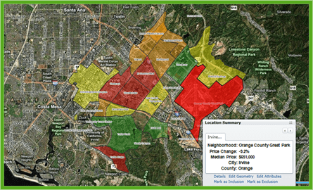
You can see an example of this below on the left. Shown is a residential home price trend map. The data is nicely summarized to neighborhoods so you can quickly tell which neighborhoods have had large price drops (red) and which have held their prices (green). When a user clicks on a neighborhood, they can see additional stats for that neighborhood and even access related data sets.
| Home Price Trend Map | Map with Results List |
 |  |
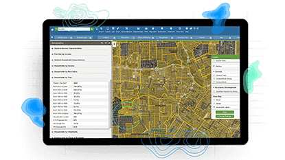
Interactive Real Estate Maps
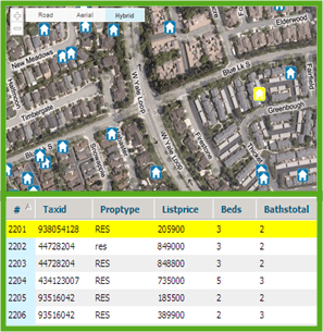
Similarly, just as you want to incorporate interactivity to your maps, you also want to tie your maps to the more traditional world of data display, otherwise known as the tabular world. Above, on the right, we show a map with a results list beneath it. It’s important to link these two features so that when a user clicks or hovers over a house on the map, it highlights in the list below and vice versa. Taking this a step further, we love to tie our map data to graphs so we can easily switch among data visualization methods and quickly explore our data.
Below are a few tips and techniques for including interactivity in your maps that will delight even the most demanding of consumers:
- If you have a map with data, even a point, let users get more information by clicking on it
- Give users map-search options using selectable areas, custom-drawn boundaries and to map extent checkboxes
- Bridge the spatial and tabular worlds by making sure your maps are interactive with your search results lists and charts and graphs
- Let users drill into maps for additional views and layers of information
- Achieve mapping guru-status when you embed animated maps to show trends over time!
Remember, avoid dead-end maps and the inevitable user disappointment that ensues by building in interactivity to your maps and linking your map experience with the non-map data world. And with that mapping faux pas safely checked off your list, you’re ready to address our fourth common mapping mistake: “Loading Map Syndrome.” Check back next week for a spirited discussion with Skip around online mapping performance and how it can go so wrong!
