This week brings us to #5 in our Real Estate Mapping Faux Pas series: Bad Data Visualization. This is one of my favorites and a mistake I see so many people committing without even knowing it. As a disclaimer, I will admit I’m a bit of a data visualization zealot so bear with me, but I can’t emphasize enough how far good data display goes towards enhancing the usability and comprehension of information, particularly with complex data sets. That being said, let’s talk mapping data visualization, why it’s important, and some of the ways people get it so wrong.
Digital Maps Should Help You Visualize Data
First and foremost, maps are an extremely intuitive way for people to access and analyze data, particularly large data sets and/or multiple data sets simultaneously. As humans, our brains are hard-wired to understand maps, and location is a universally understood characteristic. So if maps are theoretically so great for working with information, why do they have such a bad rap for being hard to use? In short, Bad Data Visualization Techniques! Poor data display tactics can render even the best-conceived mapping application useless; it’s time we stop blaming the map for its usability shortcomings and start blaming the people making the maps.
| Avoid Information Overload | Avoid Pie Charts on Maps |
 |  |
Common Digital Mapping Mistakes
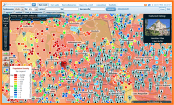
Now that we’ve isolated the root cause for many of the confusing maps out there, what are some of the most common mistakes? The first, seen above and to the left, is putting too much data and too little legend information in one map view. This leads to information overload and makes it virtually impossible for your users to make sense of any of the data sets displayed on the map. The well-known real estate website pictured is attempting to show population density with 11 classes of data, school locations, featured properties, and properties for rent. Not only is there way too much data, but it’s not clear what each symbol or color represents. And 11 classes of data? That’s way too many for the average consumer website.
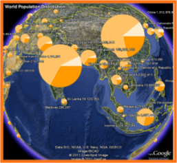
While the map on the left is clearly difficult to understand, and ugly, the map on the right may initially seem appealing, however, it is nearly as bad as the map on the left. First, in the data visualization world, pie charts are a big no-no, so putting pie charts on maps, is a bigger no-no. The pie charts obscure one another and it’s virtually impossible to distinguish what the colors and size of the pie chart represent, not to mention what the actual values being measured are. This is a perfect example of just because something looks cool, doesn’t mean it’s the optimal means to display data. In fact, often the best map visualizations, and the most difficult ones to create, are the simple ones.
Optimize Your Digital Maps
To keep you from creating “mapping don’ts” due to bad data visualization, I’ve summarized some helpful tips to keep in mind as you’re organizing, styling, and displaying data:
- We’ve mentioned this before, but it applies here as well – before you throw data up on a map start with the end in mind. Think about who will be using this data, and what conclusions you want to help them draw from it.
- Before everything else, make sure your data is clean and you understand its nuances – does your data set have outliers? How is it distributed? Where does your data have holes? Exploring and getting to know your data will help you select your display scheme.
- When classifying your data, or summarizing it, use a limited number of classes and intuitive color schemes.
- Resist the urge to show all your data on the map at once – in lieu of 30,000 points on a map, summarize your data to easily understood geographies to make it less overwhelming for users. When you select your geographies, select ones that mean something to your users.
- Give users creative options to explore your map data such as animations, drill downs, etc.
Make Your Real Estate Site Stand Out
The most important takeaway is that even if you have the slickest, fastest, easiest to use mapping application, and have avoided all our other Faux Pas up to this point, you must invest the time and thought into proper data display to prevent your site from becoming a major Mapping Don’t! Now that you understand some of the most important tips for good map display, you too can banish ugly maps and put good data visualization principles to work for you to enhance your user experience and make your real estate site stand out from the pack. And be sure to check back next week for a discussion with Skip on how to take your map beyond just the property location.
